Principles of a Good Visualization
Edward Tufte is an American Statistician who published a book named Visual Display of Quantitative Information. In this book Tufte mentions some principles which are considered gold standard for good visualizations by many. In this report we are going to discuss these principles.
Tufte’s principle of Graphical Integrity
Following are the six Tufte’s principles of Graphical Integrity:
- The representation of numbers, as physically measured on the surface of the graph itself, should be directly proportional to numerical quantities measured.
- Clear, detailed and thorough labelling should be used to defeat graphical distortion and ambiguity. write out explanations of the data on the graph itself. Label important events in the data.
- Show data variations not design variations
- In time-series displays of money, deflated and standardized units of monetary measurement are nearly always better than nominal units.
- The number of information-carrying (variable) dimensions depicted should not exceed the number of dimensions in the data.
- Graphics must not quote data out of context
Tufte’s Principle of Design
- Above all show data.
Here comes the concept of Lie factor as described by Tufte’s.
Lie factor can be summarized as ratio of the size of the graphic in the visualization to the size of the data itself. A ratio of 1, shows the visualization is able to represent the real nature of data. Any deviation from 1, either undermines or exaggerates the effect. Another term described by Tufte’s is Chart Junk. Chart Junk is the extra effects on the visualizations that do not add any new information to the graphics. They just consume space and create more clutter. Grid lines usually come in chart junk. Grids should usually be muted or suppressed in the final visualization because grids are meant for initial plotting and not for final version.
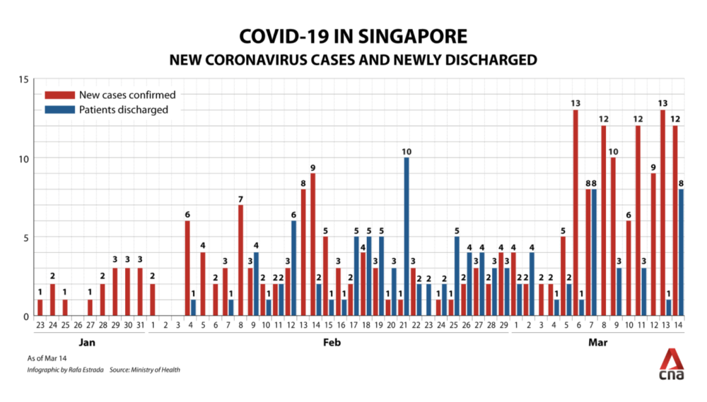
In the above visualization, lot of grid lines create clutter. Gives an incorrect interpretation of the data. The information conveyed is not clear in first look. Also, the axis labels in the X-axis seems to be too cluttered. The number of x-ticks can be reduced, and the axis would be less cluttered without any loss of information.
- Maximize data ink ratio
Data ink ratio can be described as the ratio of the non-erasable core ink in a graphic visualization to the total ink used in the visualization. If the data ink is removed, then valuable information is lost. In order to remove chart junk, we should aim for higher data ink ratio.
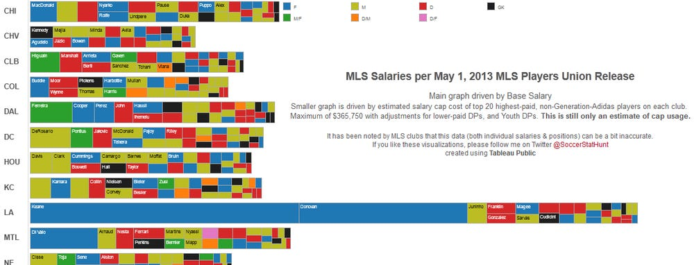
In the above visualization, what the author is trying to depict is not at all clear. The visualization is too cluttered, labels are not visible in the first go. Also, the data ink ratio seems to be low as more ink is used to depict non-data items and less on data. Different colors are too confusing and information conveyed through them cannot be understood.
- Erase non data ink
If there is loss of information when erasing some graphics then that is called as core ink or non-redundant ink. Remove non data ink to improve the data ink ratio and get better visualization.
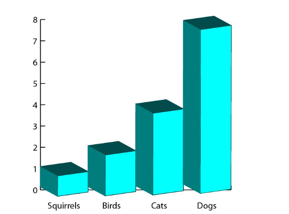
In the above image, there is a lot of Non-Data Ink. These include, 3D design, Y axis which should be removed to make the graph depict the data accurately. Labels can be placed on the bars to make it easier to read.
- Erase redundant data ink
If there is repetition of information or labels than that particular data ink needs to be removed as they are redundant and don’t add to any additional information for the user.
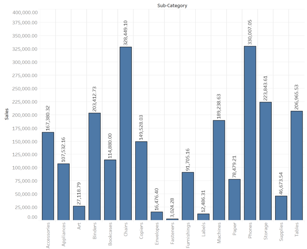
In the above image we observe that the bars have labels and the axis also have labels. This creates redundant labels and thus redundant data ink. The ticks on the Y axis should be removed. Also, grid lines create chart junk here which should also be removed.
- Revise and edit
Prior to publishing, we should carry out the above steps again to revise and make the visualization better for viewers.
References:
- The Visual Display of Quantitative Information by Edward Tufte
- Figure 1 taken from https://analythical.com/blog/covid19-in-charts
- Figure 2 taken from https://www.businessinsider.com/the-27-worst-charts-of-all-time-2013-6?IR=T
- Figure 3 from Principles of Data Visualization by James Bernhard
- Figure 4 taken from https://www.whattheviz.com/post/show-the-data-understanding-data-ink-ratio


Nice blog about visualization